Bespoke Wallpaper Begins with the Room
How a hand-drawn bespoke wallcovering begins with the room: architecture, light, scale and original artwork, shown through classically inspired ornamental panels for a refined interior.
A bespoke wallcovering begins long before a motif is drawn. It begins with the room.
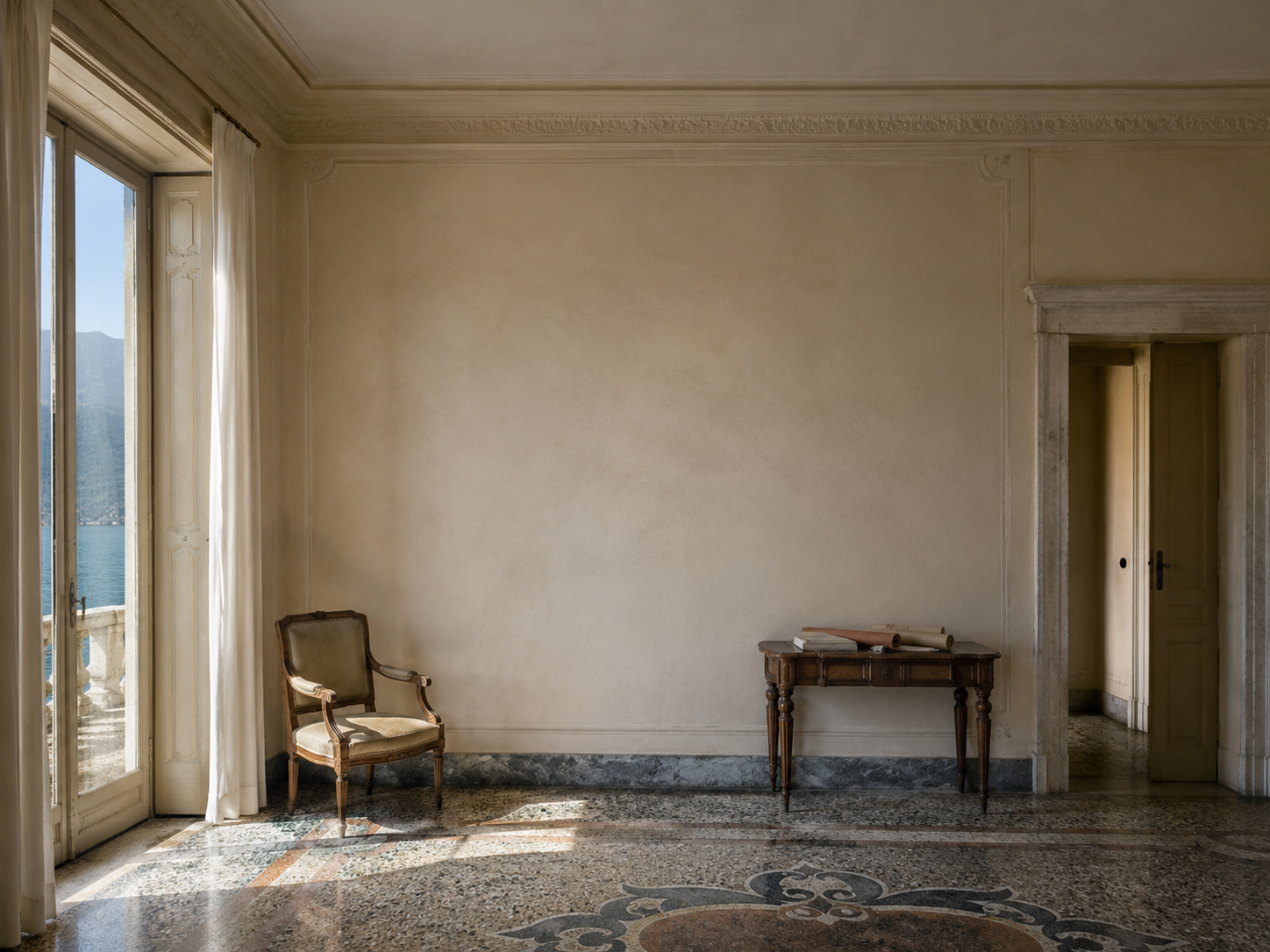
Before any artwork is developed, there is the architecture to understand: the height of the ceiling, the rhythm of windows, the position of doors, the depth of a cornice, the fall of natural light across plaster, timber or stone. Then come the more personal details: a favourite fabric, an inherited chair, a garden beyond the window, a colour already belonging to the house, or a particular atmosphere the room is meant to hold.
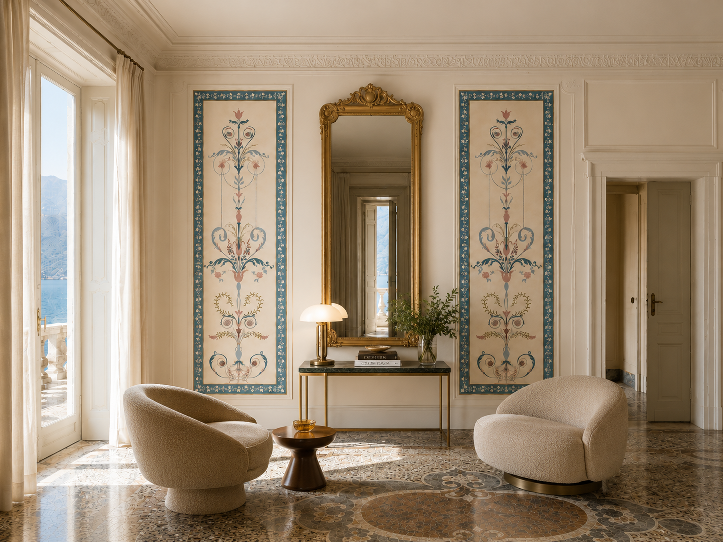
This is where a commissioned design differs from choosing a ready-made roll. It is not simply selected and applied. It is developed in response to proportion, light, existing materials, decorative history and the way people move through a space. The result may be decorative, but it should never feel detached from the interior.
Patterned Design creates hand-drawn bespoke wallpaper and custom wallcoverings for refined residential and hospitality interiors. Each project is developed from original artwork through scale, colour, repeat, sampling, print preparation and installation planning, so the finished piece belongs naturally to its setting.
Beyond the Ready-Made Roll
Ready-made wallpaper has its place. When the colour, scale and pattern language are already right, it can resolve a room beautifully. A bespoke commission enters at a different point: when the interior calls for a more exact answer.
A private house may need a design drawn to sit with existing upholstery, antique furniture, panelling or curtain fabric. A dining room may require enough depth to hold evening light. A bedroom may call for a softer rhythm around a headboard, lamps and windows. A stair hall may need a repeat that travels gracefully across turns, landings and changing viewpoints.
For work of this kind, the right studio needs to understand both artwork and interiors. Drawing matters, but so do scale, repeat, colour, paper, print, sampling and the practical journey towards installation. A beautiful drawing is only the beginning. Once translated onto the wall, it must have the right proportion, the right visual rhythm and the right relationship with the architecture around it.
The value of bespoke work is not only originality. It is suitability. A custom design can be made more generous, more restrained, warmer, cooler, larger, smaller, more open or more detailed according to the room. It can support an existing scheme rather than compete with it.
How a Commission Usually Begins
A good commission starts with context. Photographs, approximate measurements, wall elevations where available, existing fabrics, paint colours, architectural details and furniture references all help the studio understand what the room needs.
Sometimes the brief is very clear: a hand-drawn design for a particular bedroom, dining room, hallway or powder room. Sometimes it begins more loosely, with a feeling, a period reference, a garden, a textile, or a colour palette that belongs to the house. In other cases, an existing collection design may already be close to the right direction and simply needs to be adapted in scale or colour.
This is why the first stage is not only about choosing a motif. It is about deciding the right route. A project may call for completely original artwork, a revised colourway, a change of repeat size, a coordinated scheme across several rooms, or print preparation for an interior designer’s wider project.
For private clients, the process can help turn a room into something more personal without making it over-decorated. For interior designers, decorators and architects, it gives more control over proportion, palette and how the design sits within a wider scheme.
Drawing for Architecture, Light and Scale

Hand-drawn work carries the movement of the hand. Its character comes from decisions that are almost invisible at first: the pressure of a drawn stem, the turn of a leaf, the discipline of an ornamental curve, or the restraint of the line itself. It may echo embroidery, old textiles, painted decoration, garden planting, historic ornament or something more particular to the client and the house.
But in a bespoke wallcovering, drawing has to become architecture’s companion. The artwork must be developed into a repeat that can wrap a room and make sense across real elevations. Motifs need space around them. Corners need thought. Doorways, fireplaces, cupboards, mirrors and thresholds all affect how a design is read.
Scale is one of the most important decisions. A small pattern can become restless across a large wall. A generous repeat can feel too grand in a narrow corridor or small bedroom. The right proportion depends on ceiling height, wall width, furniture placement, viewing distance and the character of the interior.
This is where bespoke design becomes especially useful. The repeat can be adjusted before printing. Motifs can be given more air. A border, panel, colourway or layout can be reconsidered. The design is not forced onto the room; the room helps shape the final piece.
Colour, Surface and Sampling
Colour is never independent in an interior. It changes with daylight, shadow, lamps, paint, timber, stone, upholstery and surrounding architecture. A shade that appears balanced on screen can become too cool, too sharp or too flat once printed on a particular surface.
A printed sample is therefore not a formality. It is the first real conversation between the design and the room. It allows the client and designer to judge colour, contrast, paper surface and scale in the actual light of the space. A ground may need more warmth. A line may need softening. A motif may need clearer definition.
Print preparation is also part of the design process, even when it is less visible. Artwork must be prepared at the correct scale and resolution. Repeats must be checked. Colour needs careful handling for production. The choice of substrate matters too, especially where the project involves bathrooms, stair halls, corridors, hotel bedrooms or other areas with more practical demands.
Patterned Design can support this journey from original artwork to print-ready design, working with specialist printers and providing installation guidance or coordination where needed. Installation itself should be carried out by a suitable professional installer, with clear information supplied about the repeat, roll layout, surface and site conditions.
For Private Homes
In a private home, a commissioned wallcovering can create a closer relationship between the interior and the people who live there. The design may refer to a garden, a place, a textile, a period detail or a less obvious sense of mood. It can be personal without becoming literal.
A bedroom may need softness and rhythm rather than drama. A dining room may need enough presence to hold candlelight and evening shadow. A hallway or staircase may require movement and continuity. A bathroom or powder room can often take a more concentrated decorative idea, but still needs proper thought around surface, ventilation and installation.
Compared with a ready-made design, the advantage is fit: the colour can be developed around the scheme, the scale can respond to the architecture, and the pattern can be composed with the room’s purpose in mind. At its best, the result feels as though it belongs to the house, even when newly made.
For Boutique Hospitality Interiors
For boutique hotels, restaurants and other hospitality settings, custom wallcoverings have a slightly different role. They need to create atmosphere, but they also need to work across repeated rooms, public spaces, professional installation schedules and daily use.
Interior designers commissioning this kind of work usually need to consider more than the first impression. Repeat consistency, substrate, durability, light, cleaning requirements, installation planning and any relevant contract specifications can all affect the final result. A hotel bedroom, corridor, reception room and dining space may need related but distinct treatments.
A bespoke or adapted design can give a hospitality interior a more particular identity without relying on a widely recognisable pattern from a ready-made collection. It can respond to the building, the location and the wider interior scheme while still being properly prepared for production.
The strongest hospitality projects tend to be collaborative. The interior designer brings the spatial vision and the relationship between materials. The wallpaper studio brings drawing, pattern, colour and production knowledge. The printer and installer bring the technical expertise needed to turn artwork into a finished interior element.
London, the Italian Riviera and a Sense of Place
Patterned Design works with private clients, interior designers, decorators, architects and boutique hospitality projects, with a natural connection to London and the Italian Riviera.
These two settings offer different kinds of interiors. London brings layered architectural histories: townhouses, apartments, period renovations, Georgian proportions, inherited rooms and contemporary interventions. The Riviera suggests another kind of atmosphere: light, terraces, gardens, sea air, older buildings adapted for modern life.
A bespoke design does not need to describe its location literally. A house near the sea does not need shells or waves. A Georgian room does not need overt historical ornament. The connection can be subtler: a colour temperature, a botanical rhythm, a sense of proportion, a reference to old textiles, or the way a pattern holds light across a wall.
That is often where custom work is most valuable. It allows the design to be specific without becoming obvious.
From Drawing to Interior
Commissioning hand-drawn bespoke wallpaper does not need to feel complicated. The most useful beginning is a conversation around the room: photographs, approximate dimensions, existing design references, preferred colours or materials, and a sense of what the wallcovering should bring to the space.
From there, the right route can be defined. A project may call for original artwork, an adapted collection design, a custom colourway, a change of scale, sampling, print preparation, or broader support through installation planning.
The aim is always to create a design that sits naturally within the interior. Not a stock product placed onto a wall, but a wallcovering developed with the room in mind.
Questions Often Asked Before Commissioning
What kind of studio should I look for?
For a refined interior, look for a studio that understands both artwork and rooms: drawing, repeat, scale, colour, print preparation and how the finished wallcovering will be installed. Bespoke wallpaper is not only a printed image; it has to work with architecture, light, furniture, fabric and proportion.
How does a bespoke wallpaper commission usually begin?
It usually begins with the room. Photographs, approximate dimensions, existing fabrics, paint colours, architectural details and a sense of atmosphere are often enough to start the conversation. From there, the right route can be defined: original artwork, an adapted collection design, a custom colourway, sampling or print preparation.
Why choose bespoke wallpaper rather than a ready-made design?
Ready-made wallpaper can be beautiful when it already suits the space. Bespoke work is useful when the room needs a more exact response: a particular scale, colour, rhythm, motif or relationship with the interior. The value is not only originality, but fit.
What should interior designers consider for hospitality projects?
For boutique hotels, restaurants and other hospitality interiors, the wallcovering needs to create atmosphere while also meeting practical demands. Scale, repeat consistency, substrate, durability, light, installation planning and production schedules all need to be considered early.
Does Patterned Design work with projects in London and the Italian Riviera?
Patterned Design works with private clients, interior designers, decorators, architects and boutique hospitality projects, with a natural connection to London and the Italian Riviera. Projects may begin with a private house, a hospitality interior, an adapted collection design or a fully bespoke hand-drawn wallcovering.
For private residential, interior design and boutique hospitality projects, Patterned Design welcomes enquiries for hand-drawn bespoke wallpaper and custom wallcoverings developed from original artwork to print-ready design.
The Light of Liguria
A reflection on painted facades, frescoes, and the changing light that gives Ligurian colour its depth and atmosphere.
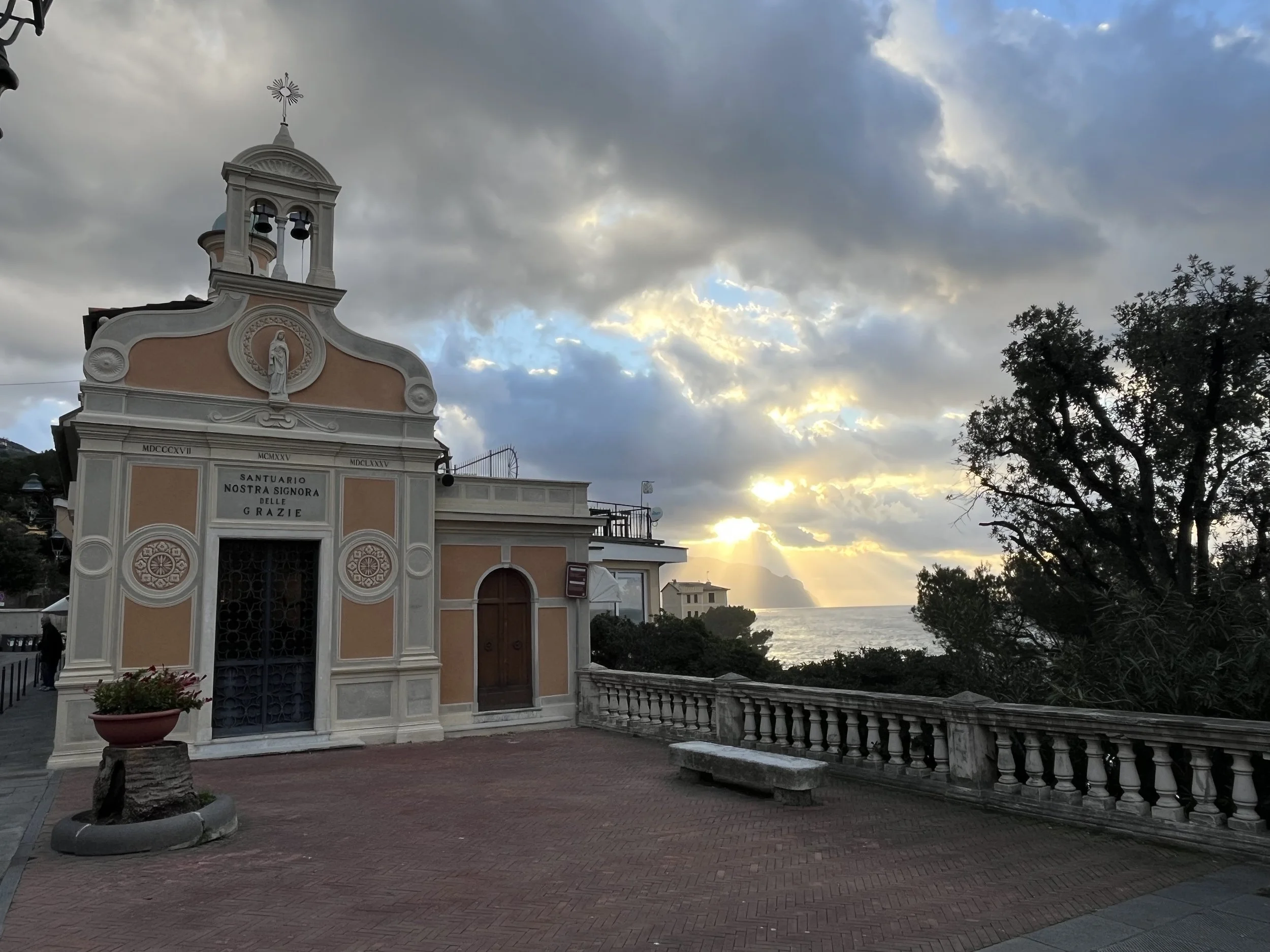
Poggio Favaro – San Bernardo,
Golfo Paradiso, Liguria
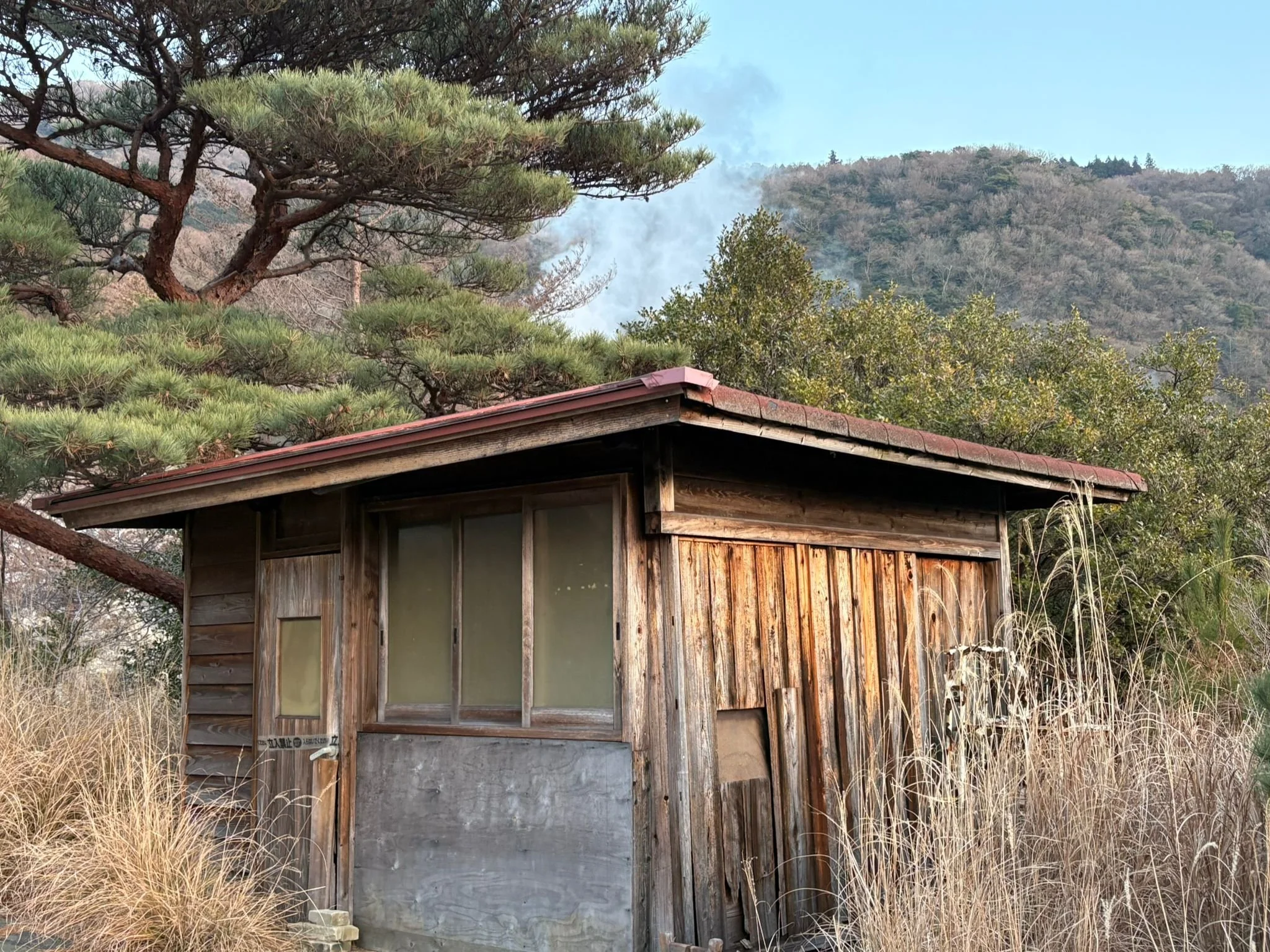
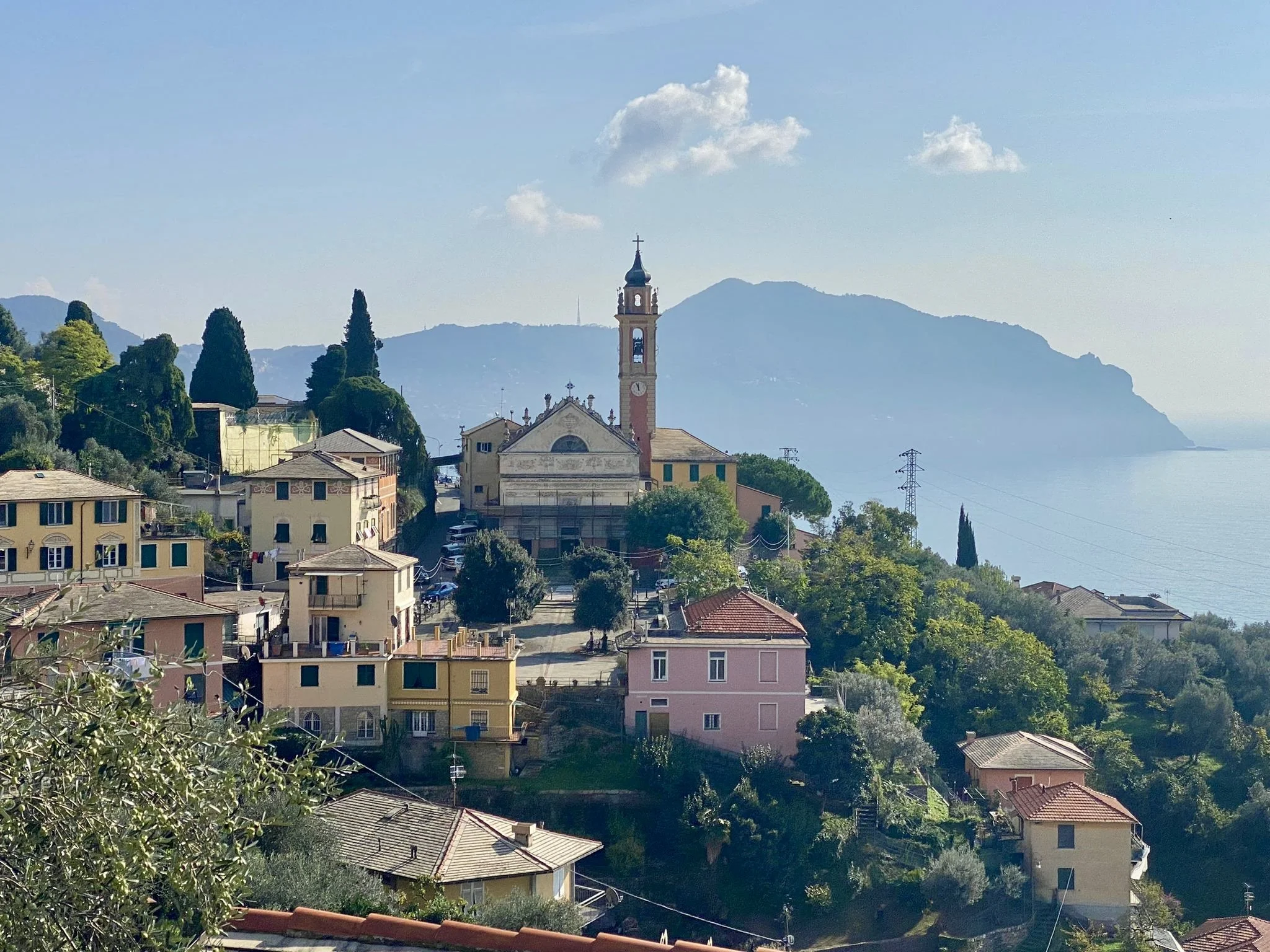
Liguria is often remembered for its painted houses and coastal villages, but what makes them so distinctive is not colour alone. It is the light. Sea haze, clear air after wind, and sudden brightness after rain constantly change the way facades, church walls, and old buildings are seen along the Ligurian coast.
That is what makes Ligurian colour so interesting. It is never static. The same building can look muted, luminous, soft, or sharply defined depending on the weather, the hour, and the atmosphere.
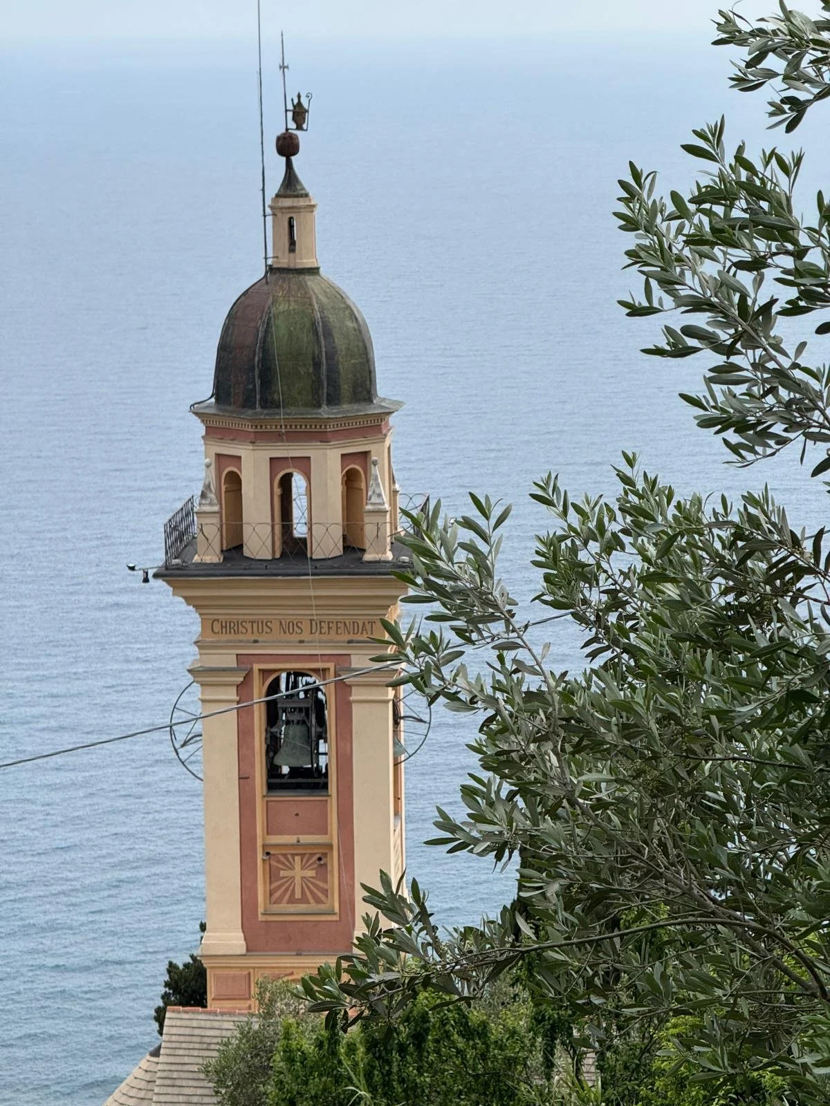
Painted facade above the sea,
Camogli, Liguria
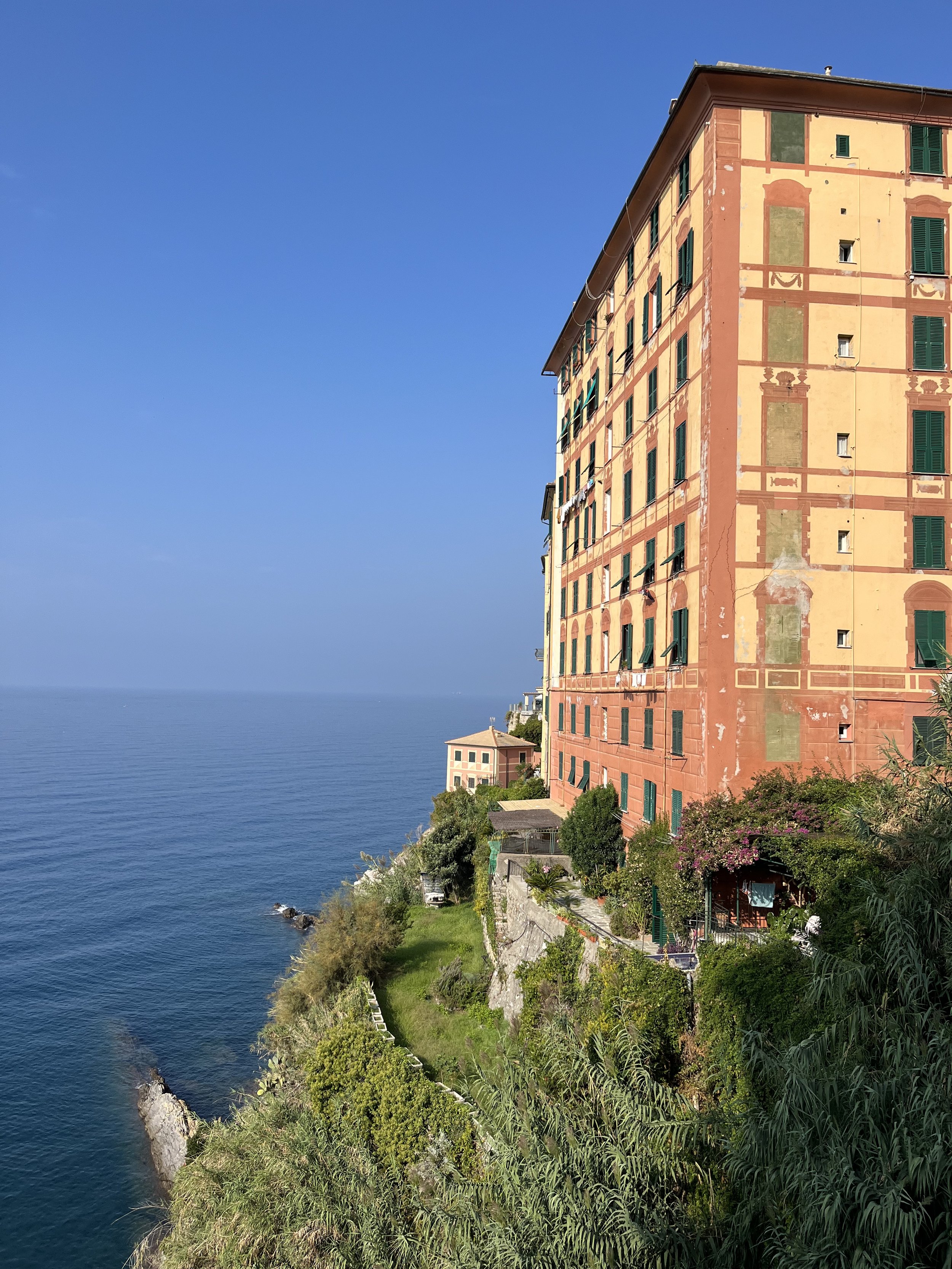
From afar, Ligurian light gives an entire village its atmosphere. Up close, it starts to do something more interesting: it reveals how these buildings are made to live with light. In Camogli, painted facades rise straight above the sea, exposed to open sky, salt air, and the changing brightness that comes off the water.
That is why their colours feel so alive. Ochres, terracottas, faded pinks, and soft stone tones do not sit heavily on the surface. They catch the light, soften in haze, and shift again as the day changes. Even before stepping inside, you can already sense the painted walls and decorative surfaces that run so deeply through Ligurian architecture.
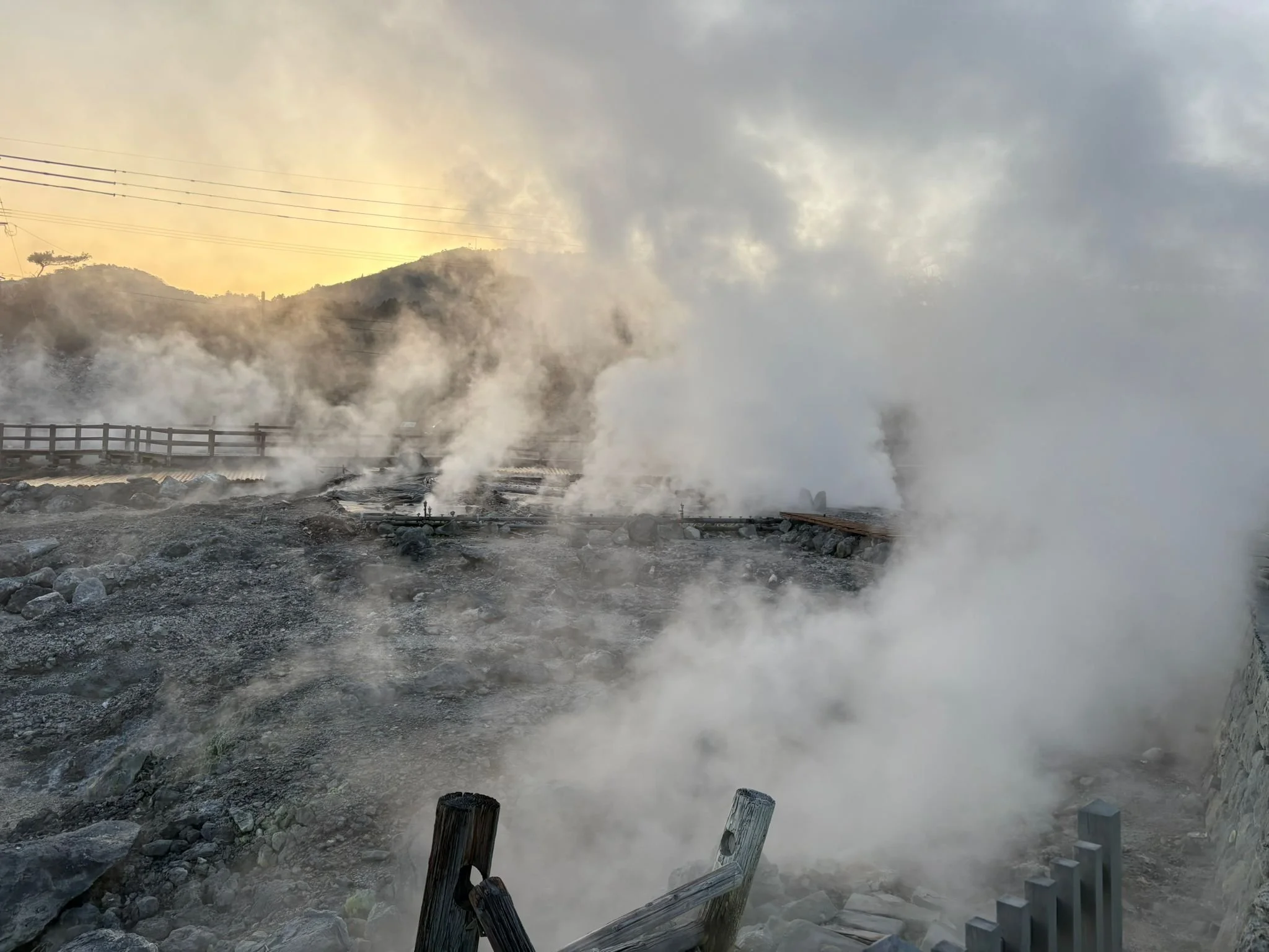
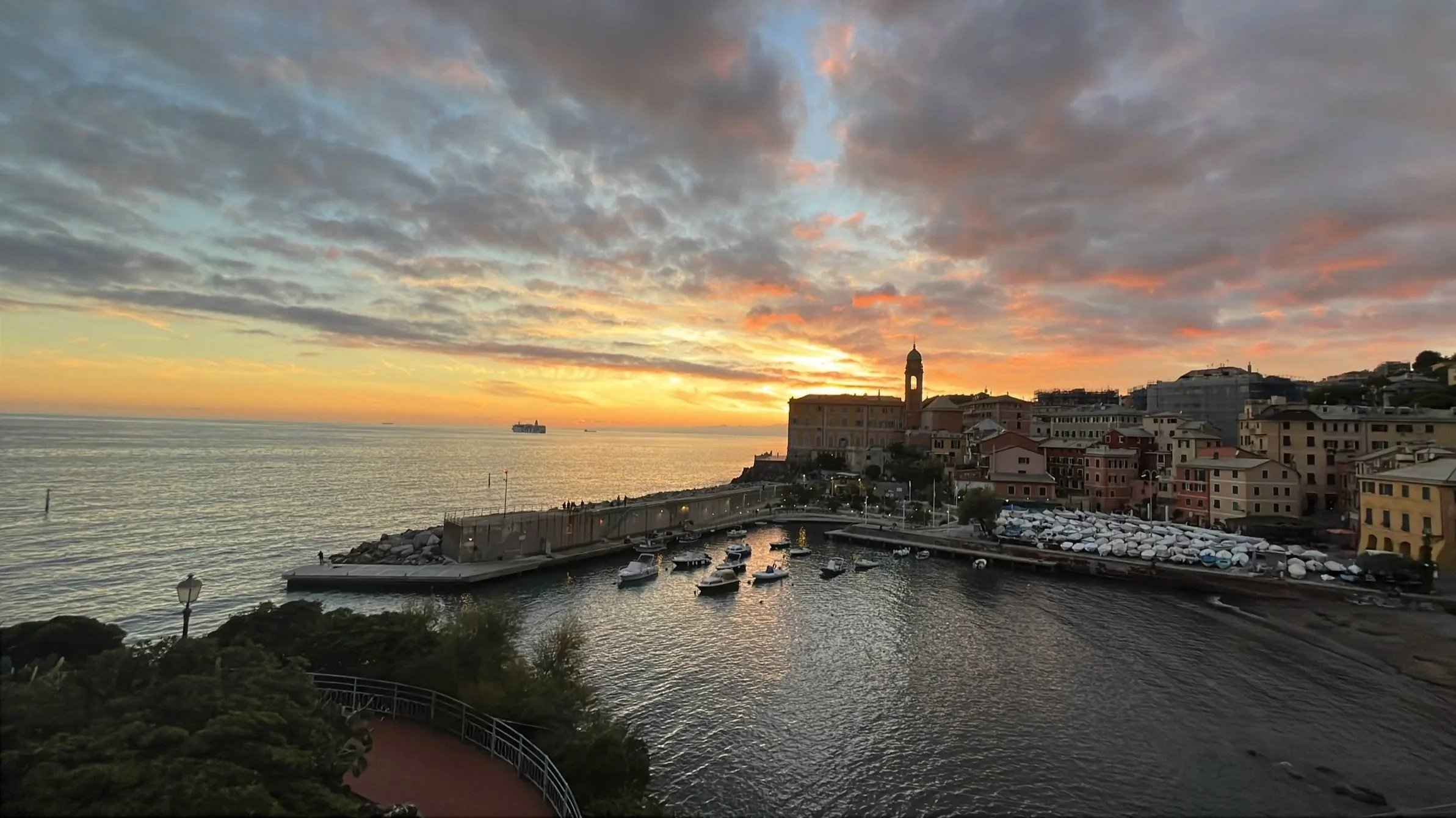
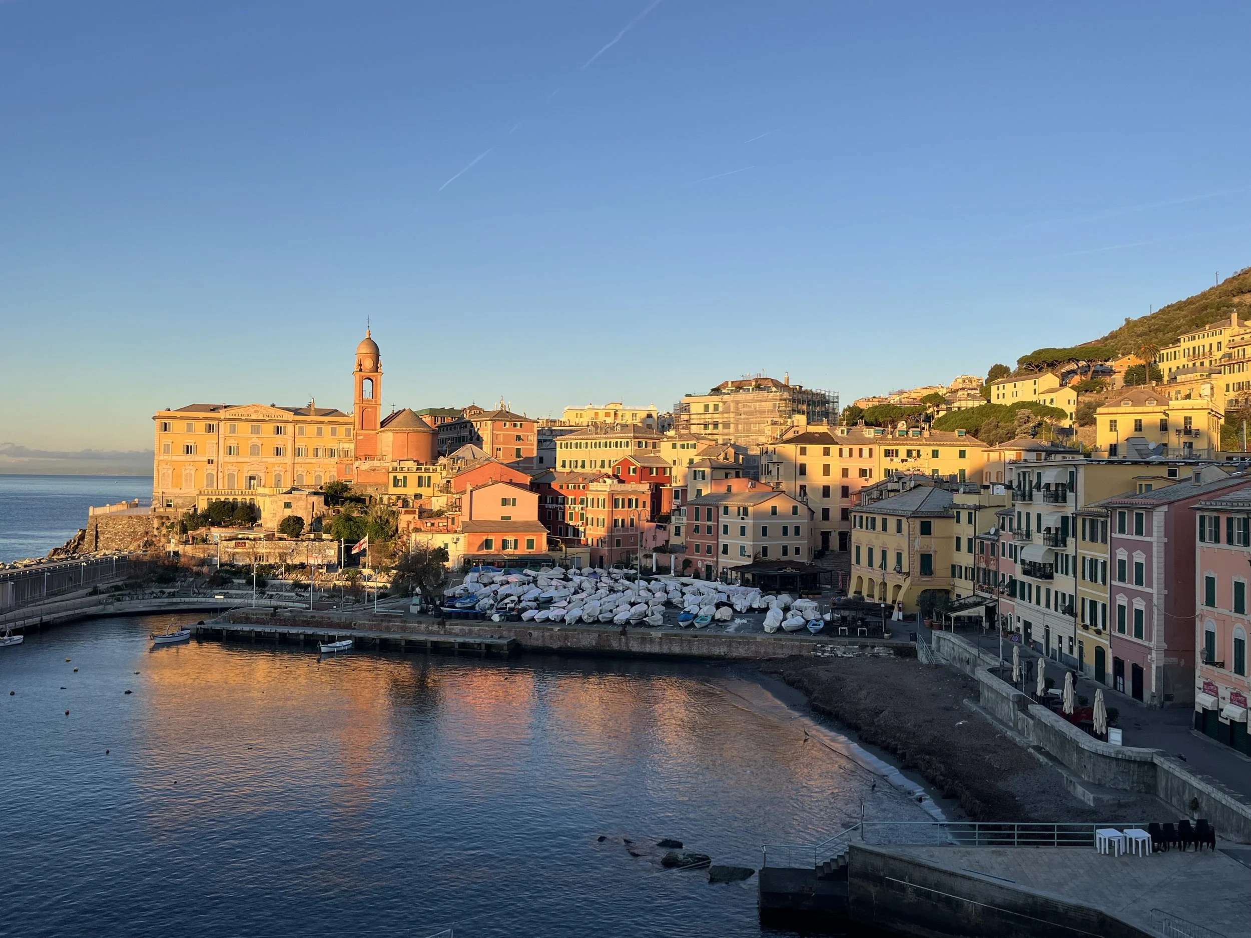
Evening light along the seafront, Genoa Nervi, Liguria
In places like Nervi, the colours of the buildings are only part of the story. What really gives them life is the way light keeps changing them. By evening, some surfaces catch warmth, others fall into shadow, and the whole row begins to separate into tone, reflection, and contrast.
That shifting quality matters. It is what gives painted walls their depth, and it is one of the reasons colour feels so alive in Liguria. Seen from the outside, these buildings already suggest a broader tradition of painted surface — one that continues beyond the facade itself.
Colour, in this way of thinking, shapes experience. It influences how a room holds light, how it settles at different times of day, how it affects mood without announcing itself. The spaces that remain with us are rarely defined by novelty. They feel grounded and layered.
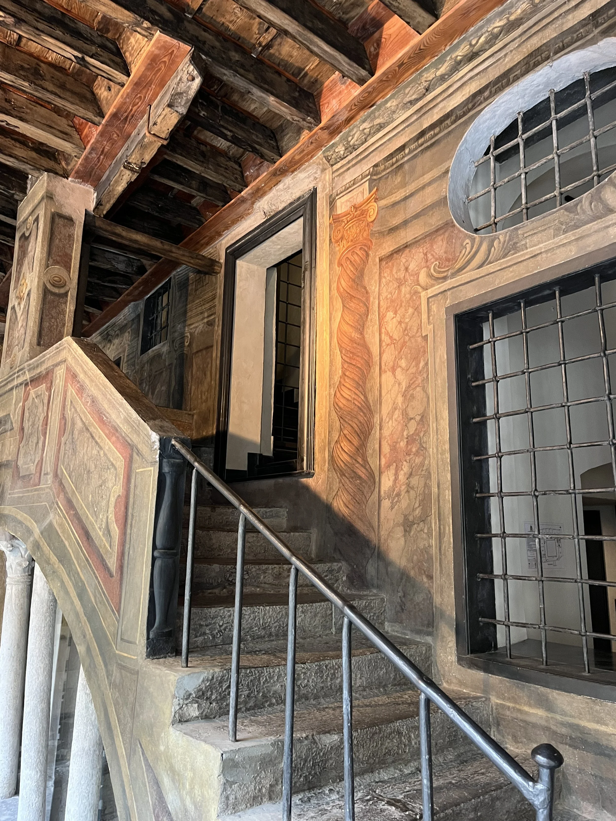
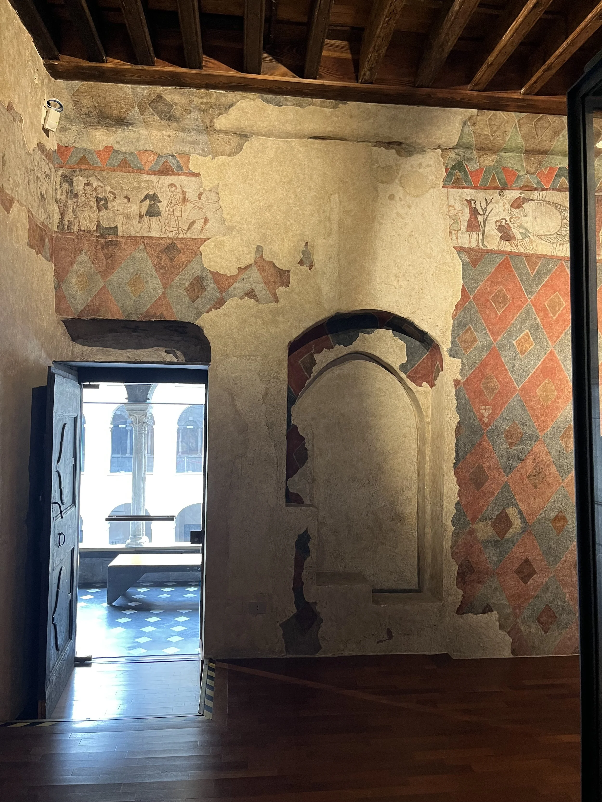
Painted courtyard walls, Museo Diocesano,
Genoa, Liguria
Away from the open seafront, the effect changes. Here the light is more contained and indirect, so the colours settle and the painted surface comes forward. Fresco, ornament, and wall decoration begin to matter more than shifting sky or reflection from the sea.
The palette remains recognisably Ligurian — warm, softened, and slightly muted — but the experience is more intimate. Instead of passing quickly across facades, the light lingers, and the eye begins to stay with the walls themselves.
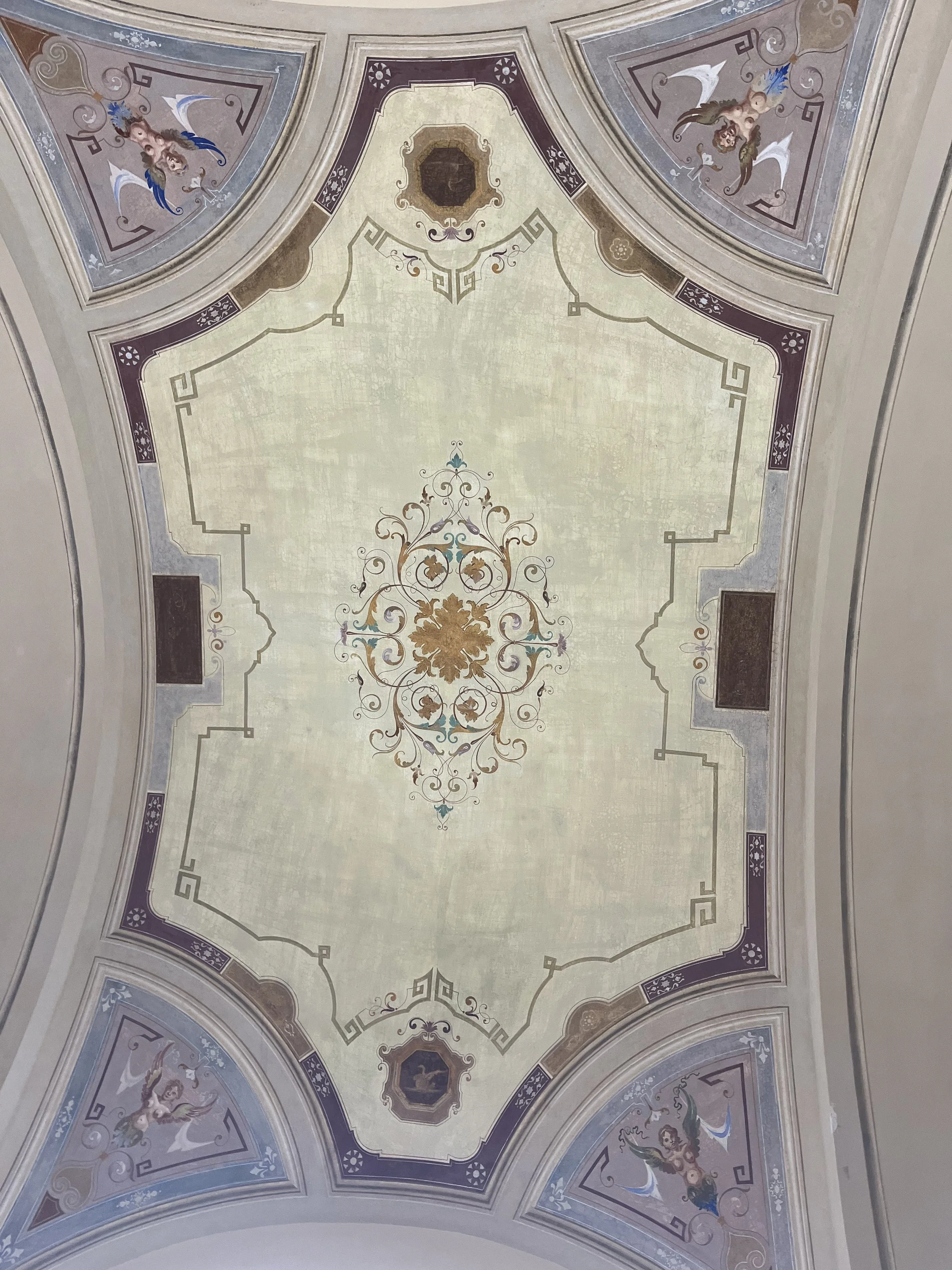
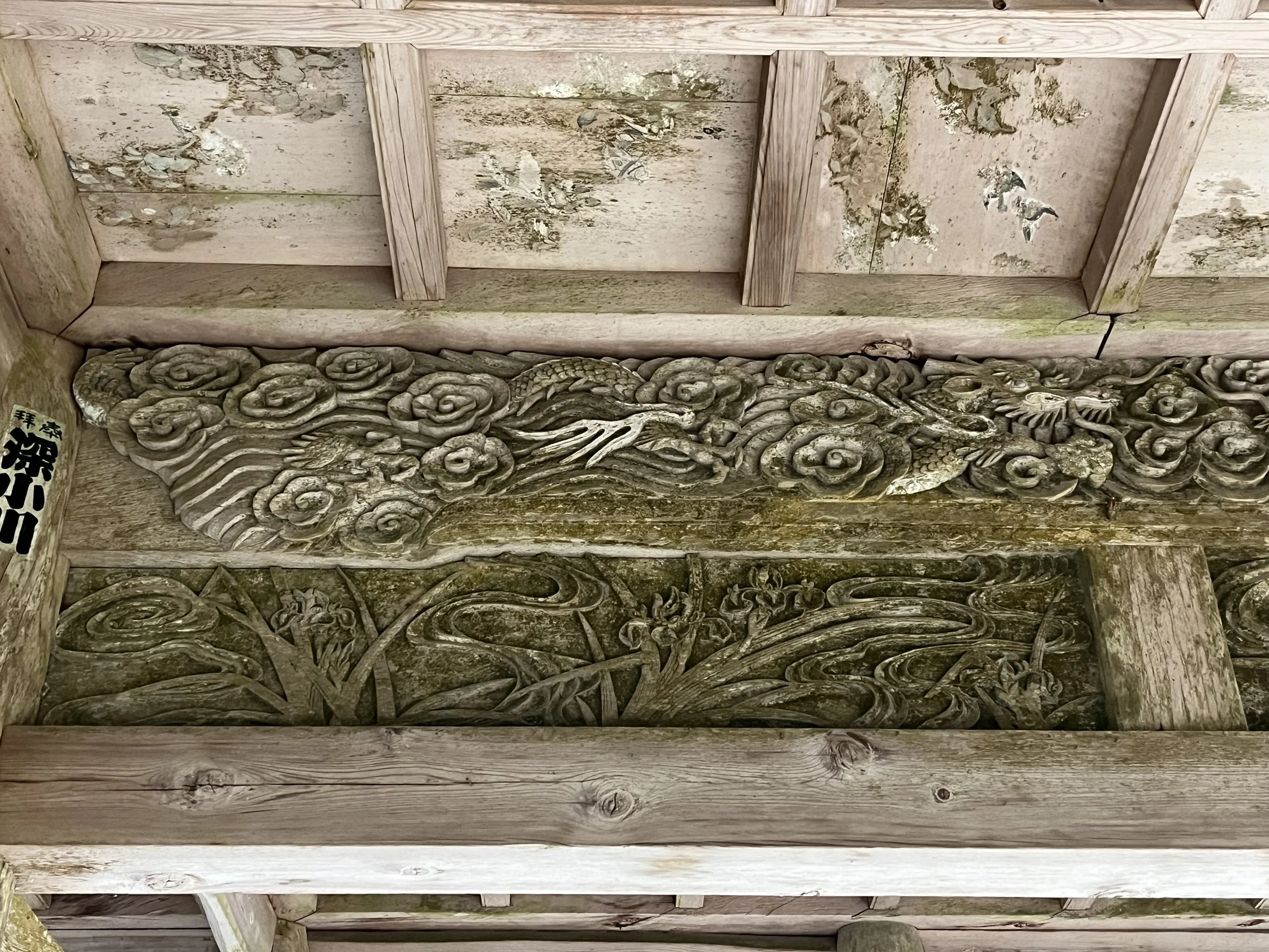
Ceiling frescoes in a Ligurian interior
Ceiling frescoes take the story further. Here, painting is no longer something seen on the outside of a building, but something built into the experience of the room itself. Colour becomes more ordered, more decorative, and more closely tied to pattern, ornament, and atmosphere.
That is why fresco matters so much in Liguria. In and around Genoa, painted ceilings and rooms were a central part of historic interiors, shaping not only how they looked but how they were felt. The colours may still relate to those seen outside, but indoors they become more composed and intentional.
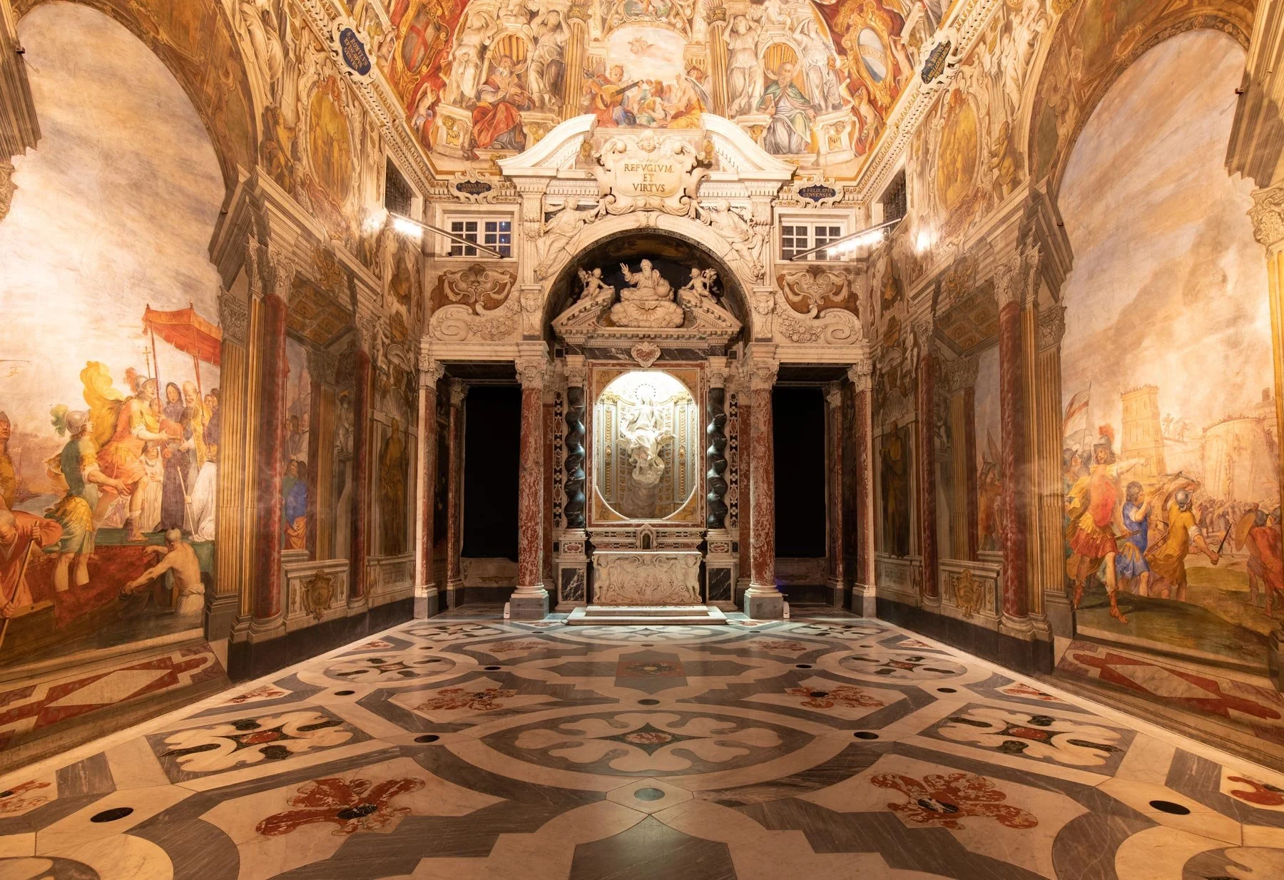
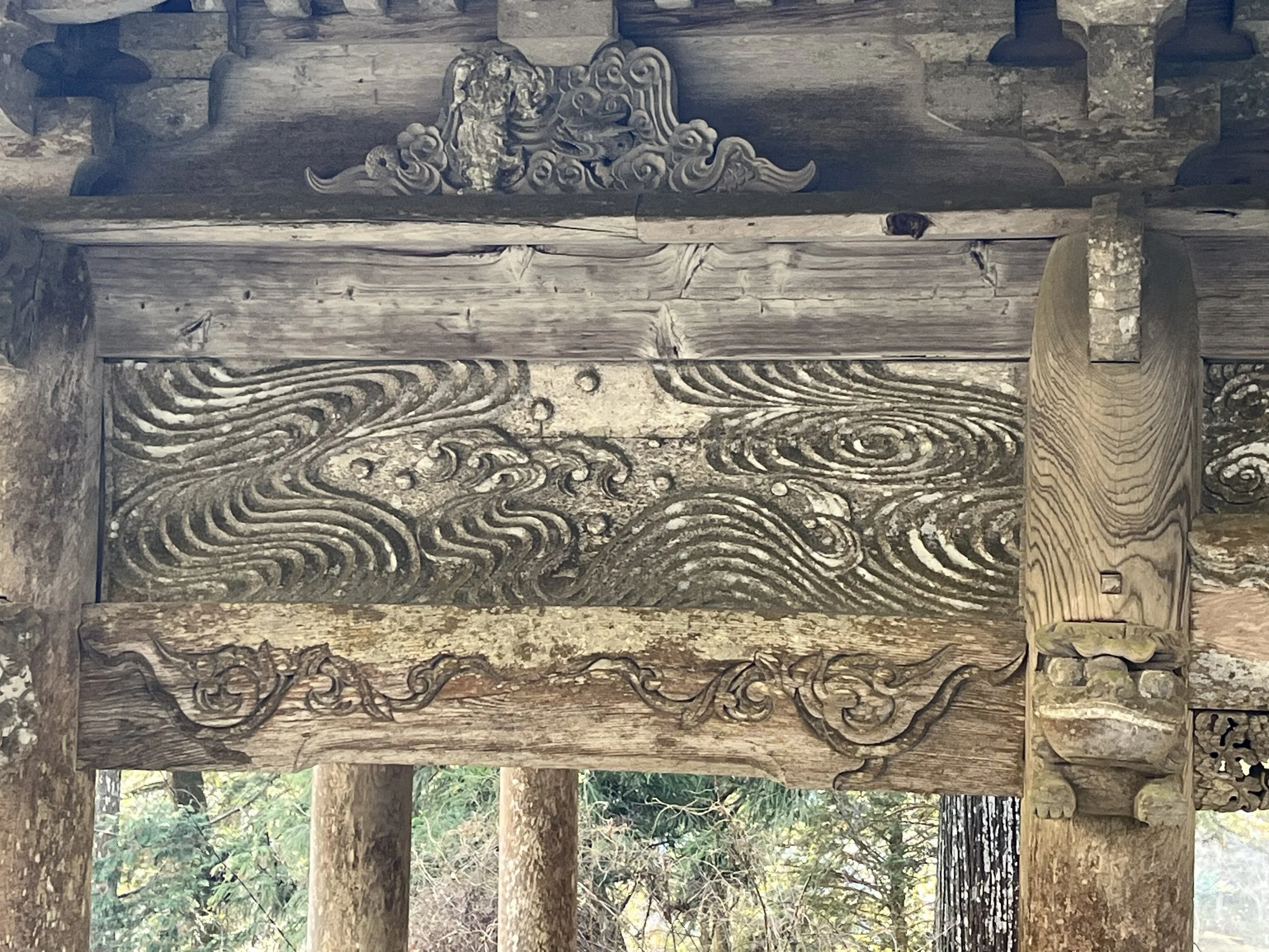
Frescoes by Giovanni Battista Carlone (1655)
The Doge's Chapel in the Ducal Palace (Genoa)
In Genoa, painted surface reaches its most ambitious form. What appears outside as colour on facades, and then inside as ornament on walls and ceilings, becomes here a complete interior language. Fresco is no longer a detail within the room; it helps define the room itself, extending architecture, directing attention, and turning colour into an immersive experience.
This is why Genoa’s palaces, chapels, and museums matter so much within the wider Ligurian picture. They preserve the region’s painted tradition at its most elaborate and accomplished. The scale is grander, the compositions more theatrical, but the same concerns remain: surface, tone, atmosphere, and the power of colour to shape how a place is felt.
From village facades to courtyard walls and painted ceilings, the same thread runs through it all: colour here is always being reshaped by the way it meets the light. Perhaps that is what stays with me most in Liguria: not colour on its own, but colour made visible, altered, and brought fully to life by light.


The Memory of Colour: Traditional Japanese Colours in Interiors and Textiles
A reflection on traditional Japanese colours in interiors and textiles, and on the quiet way colour deepens through surface, time, and memory
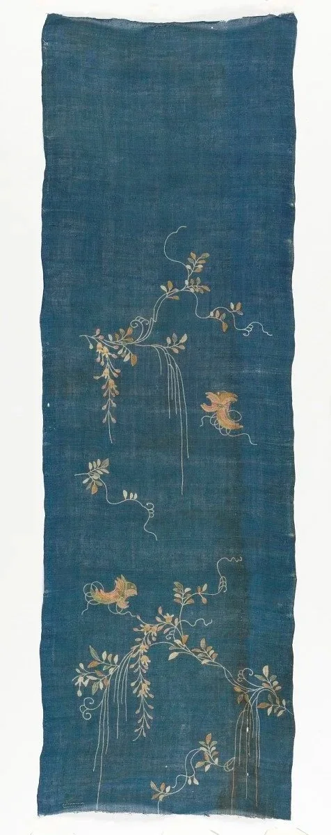
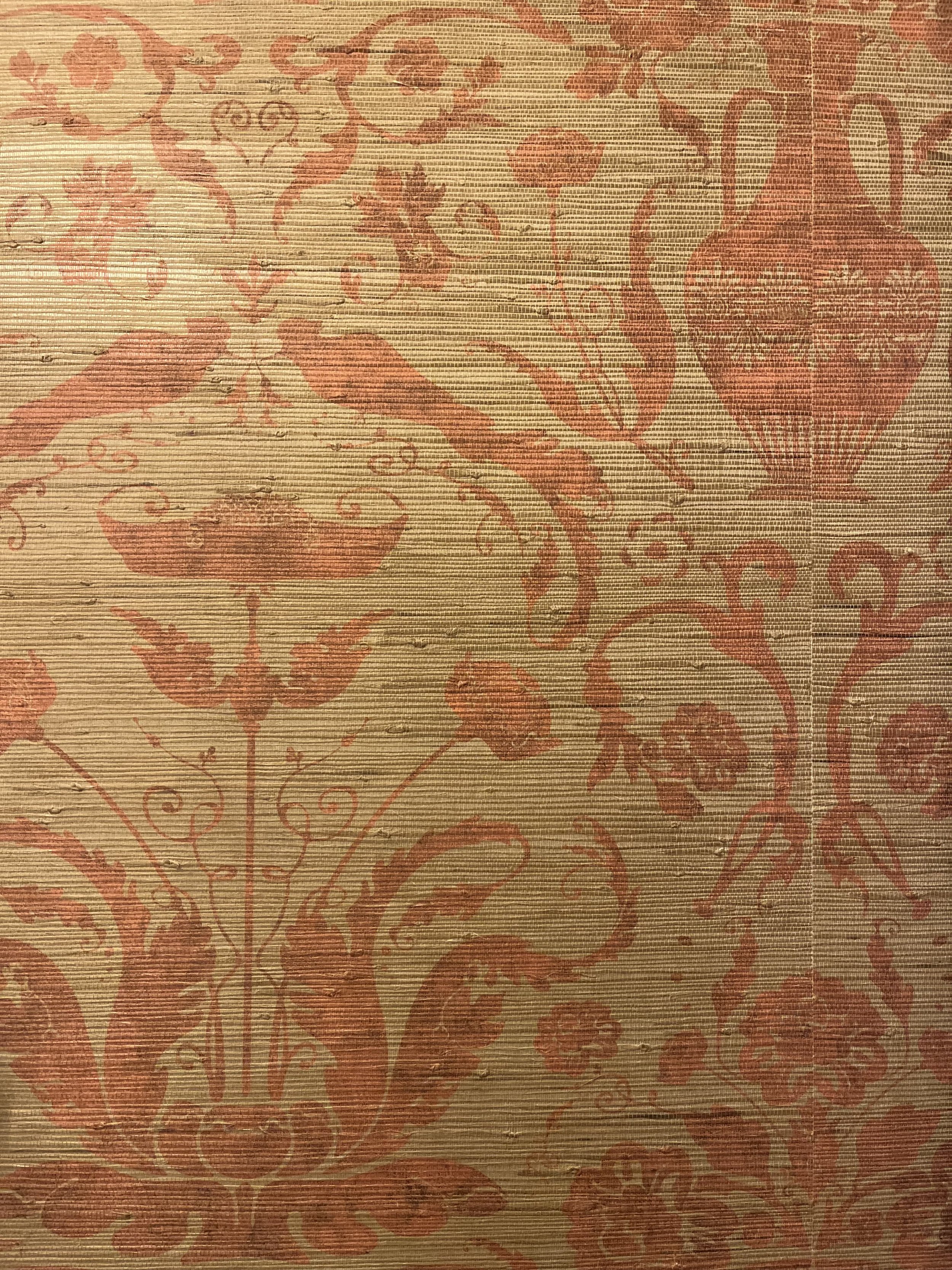
Kimono fragment
late 18th century, Kyoto
When we travel, we often remember places through images — architecture, food, landscapes. In Japan, what stayed with me most was colour.
It revealed itself gradually, through surfaces. Timber deepened by weather. Indigo fabric softened at the folds. Plaster holding warmth from the sun. The tones felt settled, as though they had grown into their surroundings rather than been applied to them. That sensation led me to look more closely at how colour is understood in Japan. Many traditional colour names refer to seasons, materials, or very specific moments. They are not abstract labels.
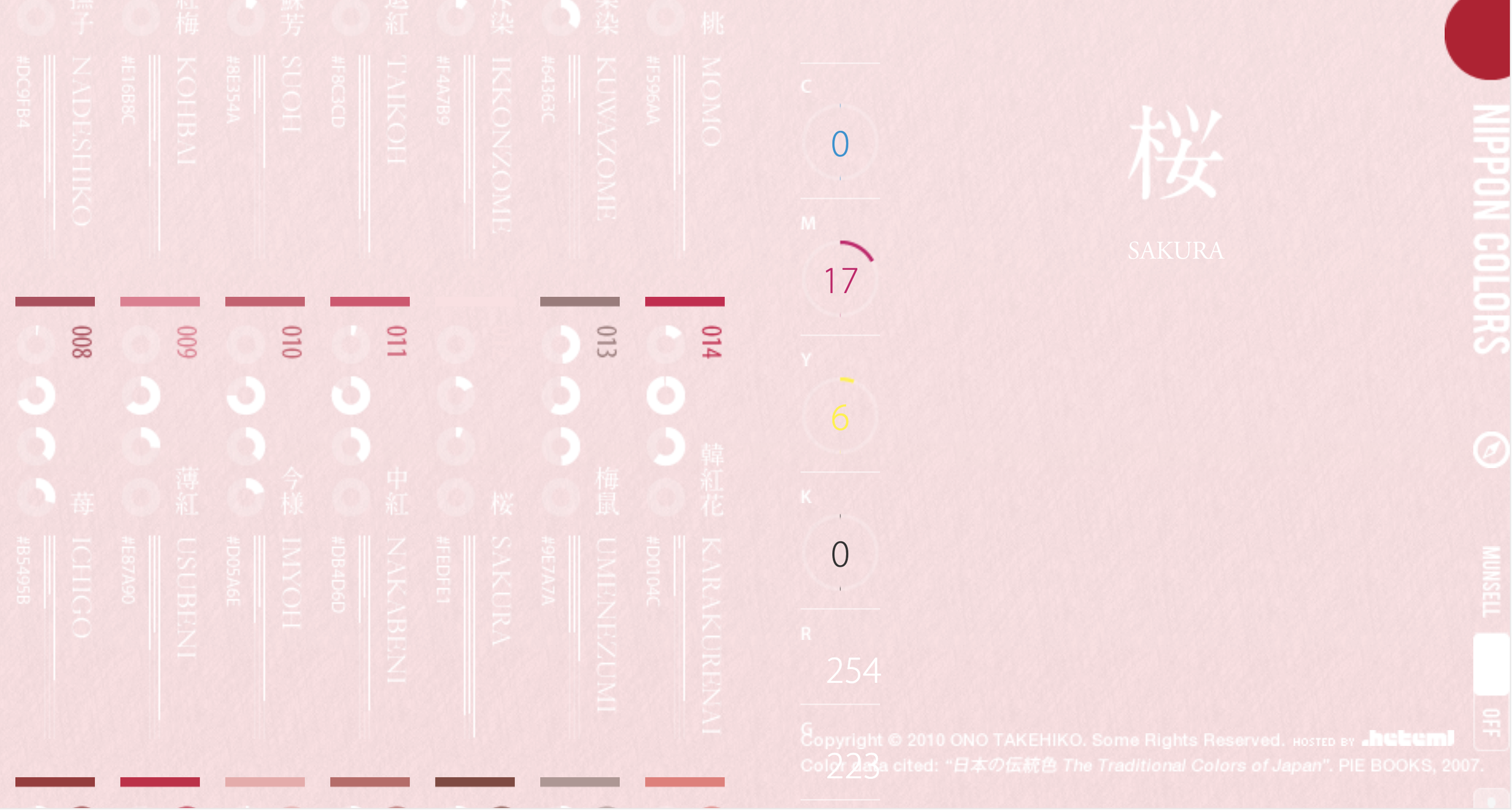
Sakurairo evokes the pale tone of cherry blossom.
Ruriiro refers to a deep lapis blue.
Kogecha suggests the brown of roasted tea.
Aijiro carries the faintest trace of indigo.
Each name anchors colour in experience. It connects tone to something tangible — something that has existed in the world.
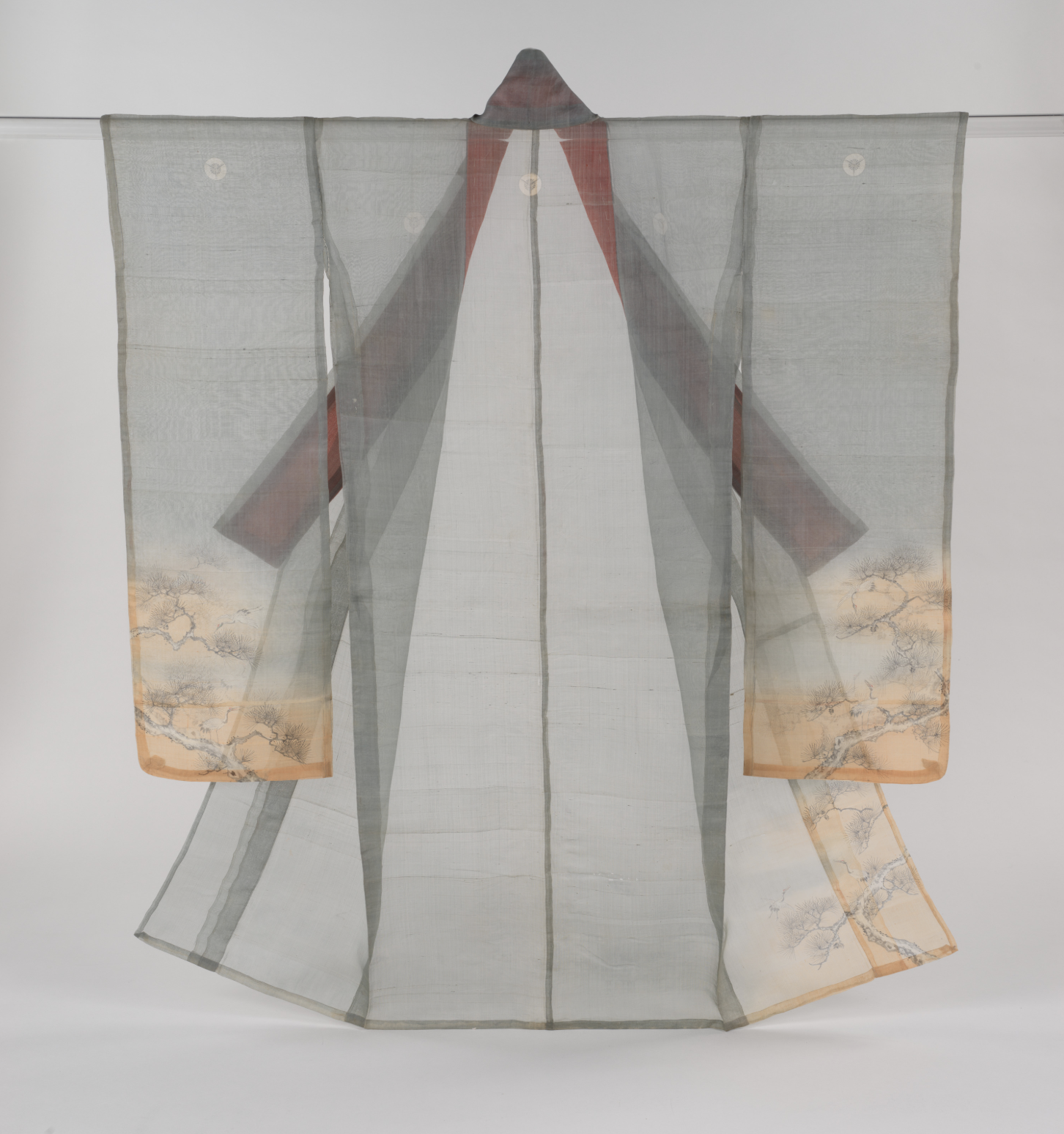
Summer robe (hito-e) with cranes and pines
Meiji period (1868–1912)
ca. 1870–80s
There is also an idea about blue that moved me deeply. Certain shades of indigo are considered most beautiful after time has softened them. The colour develops through wear, through exposure, through living. It cannot be rushed. It matures.
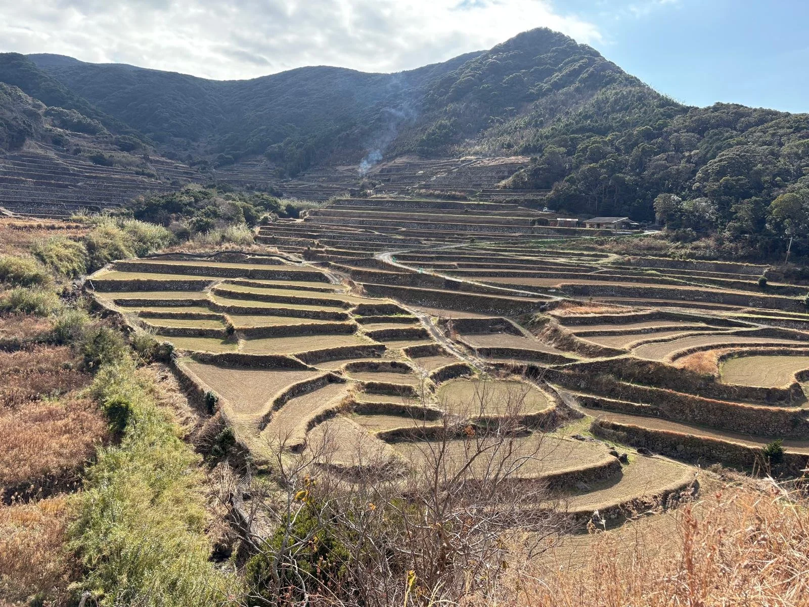
Terraced rice fields, Kyushu, Japan.
When I recognised this philosophy, it felt familiar. I have always been drawn to Munsell — a Western colour system that feels natural and organic in the way it arranges tone and light. It never felt mechanical to me. There is a calm logic in it. In Japan, I sensed that same respect for colour, extended further into memory and material.
Colour, in this way of thinking, shapes experience.
It influences how a room holds light, how it settles at different times of day, how it affects mood without announcing itself. The spaces that remain with us are rarely defined by novelty. They feel grounded. They feel layered.
Custom Wallpaper for a Georgian House, Kensington, London
In my design Bird Fable, I worked with warm oranges that are slightly muted and textured. I didn’t want them to feel flat or freshly printed. I wanted the surface to feel layered, as though warmth had gathered into it over time.
Japan reinforced something I already believed: colour is not a trend, and it is not a decorative afterthought. It is one of the most powerful tools in design. It can create atmosphere, shape memory, and influence how we inhabit a space.
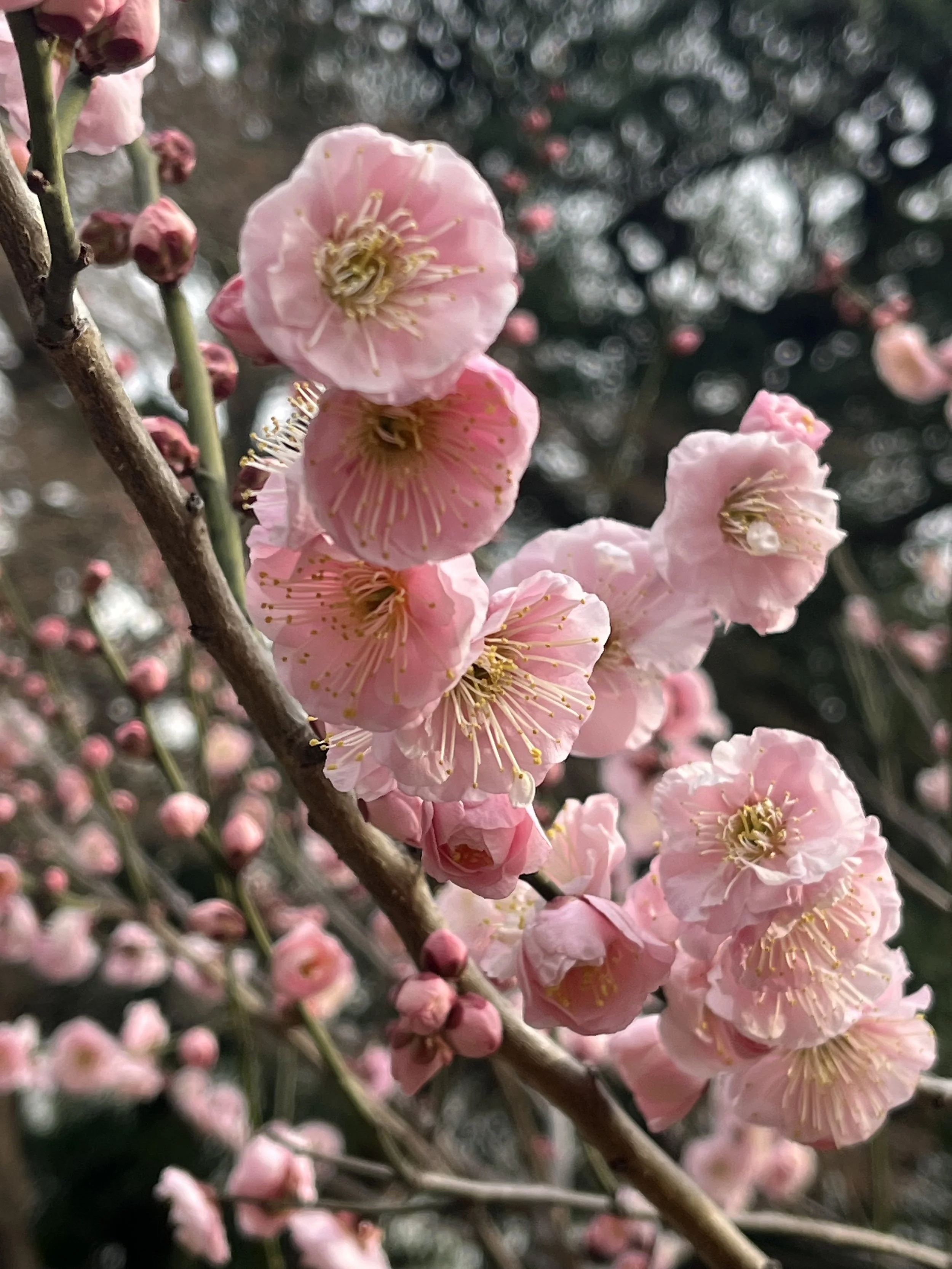
Sakura blossoms, Tokyo
For readers who want to explore further, the Nippon Colors archive presents a wide range of traditional Japanese colour names with links to nature, season and material — offering a sense of how deeply colour has been woven into Japanese visual culture.
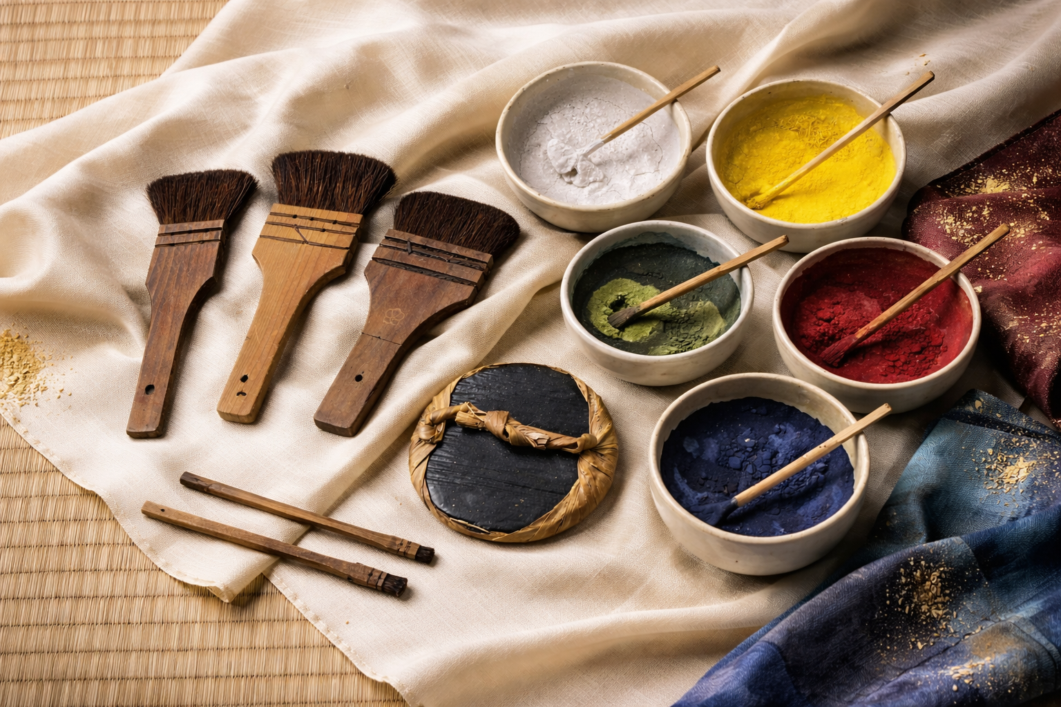
Hand-prepared natural pigments and brushes.
Perhaps the real question is not which colour we prefer this year.
It is how a colour will live with us — and what it will become.
If you are exploring bespoke wallpaper for a private home or hospitality project, you can view current collections here.